Jun 12, 2026
5 min
7 Enterprise UX Mistakes That Quietly Cost Companies Millions
What designing compliance software, fintech platforms, AI workflows, and enterprise dashboards taught me about the mistakes teams keep repeating.

Introduction
Most people think bad UX means ugly interfaces, confusing buttons, or poor visual design.
In enterprise software, the consequences are much bigger.
A consumer app with poor UX might lose a customer.
A poorly designed enterprise product can create:
Thousands of support tickets
Weeks of employee training
Compliance risks
Approval bottlenecks
Operational delays
Costly human errors
The challenge is that enterprise users rarely abandon software.
They're required to use it.
Which means bad experiences don't disappear. They become expensive habits.
Over the last few years, I've worked on enterprise SaaS products across HR compliance, fintech operations, reporting systems, AI-assisted workflows, procurement platforms, and design systems. Across every product, I've noticed the same pattern:
The most expensive UX problems rarely start with the UI.
They start with assumptions.
1. Designing Screens Before Understanding Workflows
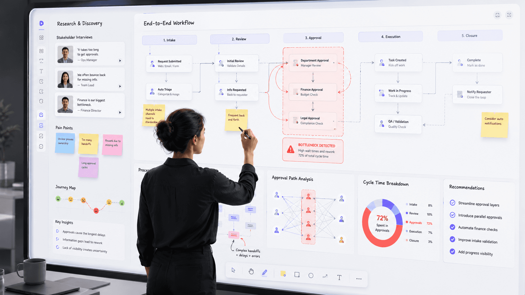
One of the most common mistakes teams make is jumping directly into wireframes.
The request usually sounds simple:
"Users need a better dashboard."
Or:
"The approval flow feels confusing."
The temptation is to redesign the screens immediately.
The problem?
Users often describe symptoms, not root causes.
I once worked on a platform where teams believed receipt management was the primary issue. After observing actual workflows, we discovered the real bottleneck wasn't receipts at all.
The process required multiple approvals happening one after another.
The interface wasn't slowing users down.
The workflow was.
When teams skip workflow research, they often create beautiful solutions for the wrong problem.
What to do instead
Before opening Figma:
Observe users doing real work
Map the end-to-end workflow
Identify bottlenecks
Understand dependencies between teams
A good screen can't fix a broken process.
2. Showing Data Instead of Supporting Decisions

Many enterprise dashboards look impressive.
They contain:
Charts
KPIs
Trend lines
Tables
Filters
Scorecards
Yet users still ask:
"What am I supposed to do with this?"
This happens because teams optimize for visibility instead of actionability.
Users don't wake up wanting dashboards.
They wake up wanting answers.
A great dashboard should answer:
What's happening?
Why is it happening?
What should I do next?
Without those answers, data becomes decoration.
The best dashboards don't display more information.
They reduce uncertainty.
What to do instead
Prioritize:
Recommended actions
Alerts
Priorities
Exceptions
Opportunities
Design for decisions, not data.
3. Treating Every User Like a Power User
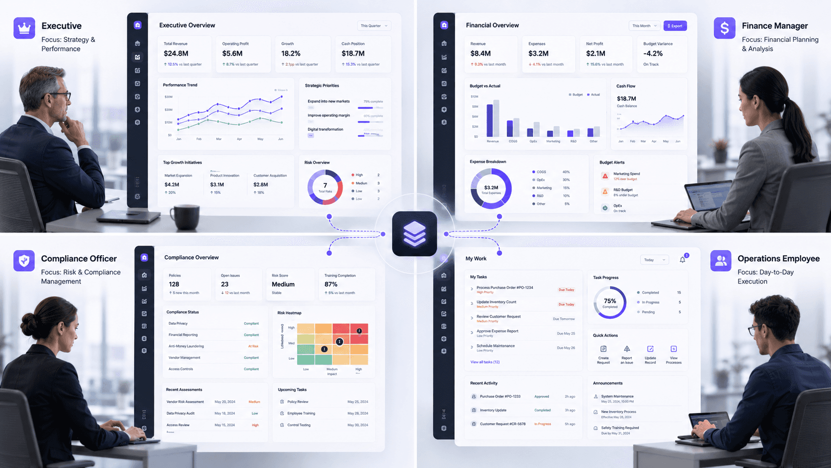
Enterprise products often serve multiple user groups.
For example:
Administrators
Managers
Analysts
Compliance officers
Finance teams
Executives
Yet many systems expose the same interface to everyone.
This creates two problems:
Beginners become overwhelmed.
Experts become frustrated.
The CFO doesn't need the same experience as an operational coordinator.
A compliance officer doesn't think like a recruiter.
A finance manager doesn't work like an employee submitting a request.
Different roles have different goals.
What to do instead
Design role-based experiences.
Focus on:
Relevant actions
Relevant information
Relevant workflows
Good enterprise UX respects context.
4. Confusing Flexibility With Complexity
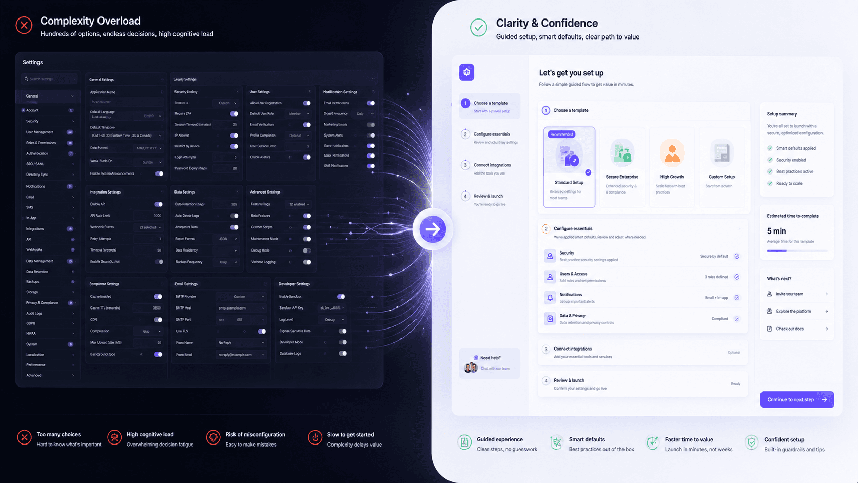
Enterprise teams often hear the same request:
"We need maximum flexibility."
So they create systems with:
Endless configuration options
Hundreds of settings
Advanced controls everywhere
The result is usually complexity disguised as power.
Many users don't want infinite flexibility.
They want a safe starting point.
Think about how many enterprise products force users to configure dozens of settings before completing a simple task.
The software is technically powerful.
But practically exhausting.
What to do instead
Provide:
Templates
Smart defaults
Guided setup
Progressive disclosure
Give users complexity only when they need it.
Not before.
5. Designing AI Without Designing Trust
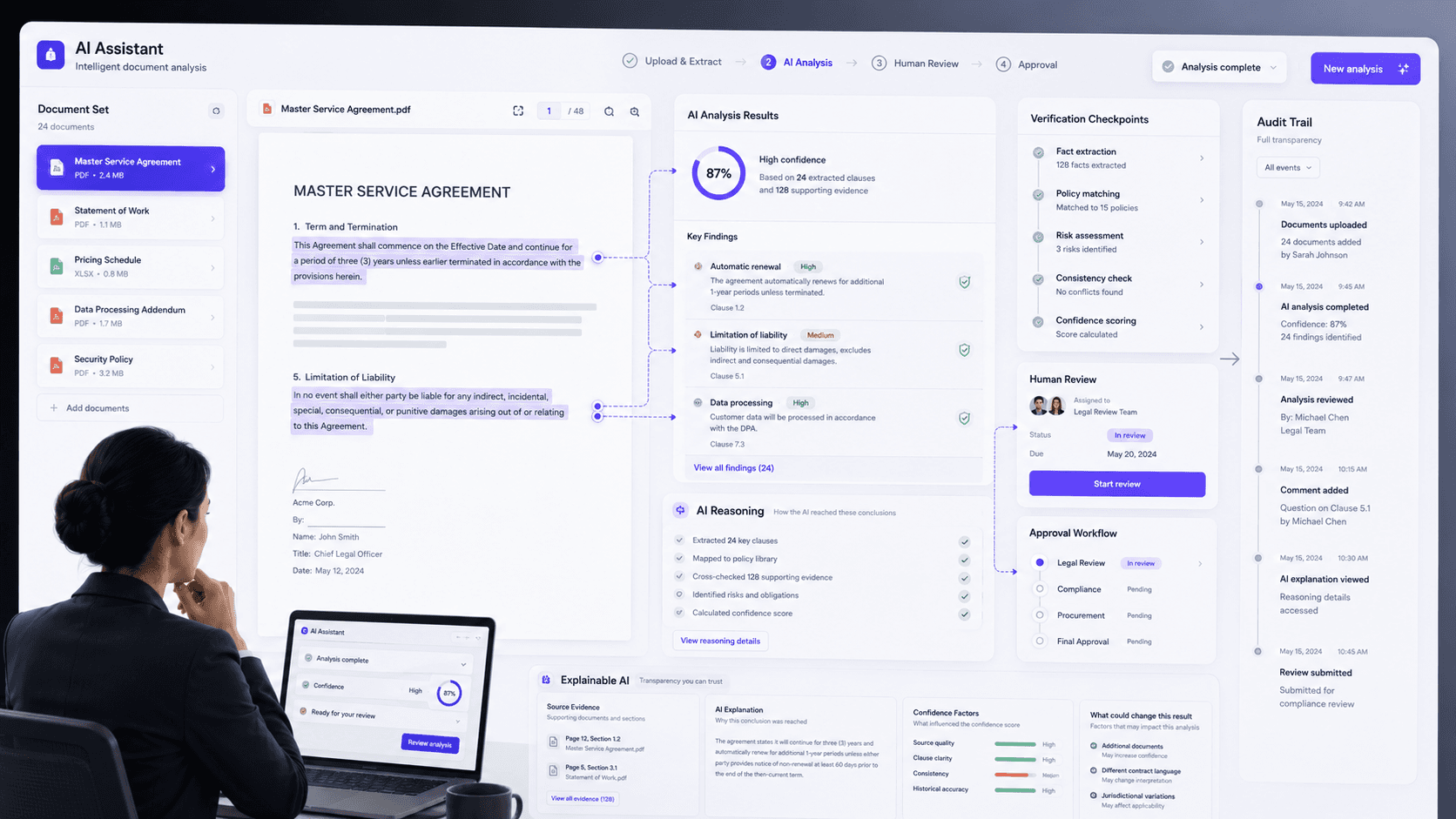
AI is everywhere.
But many AI products still make the same mistake:
They focus on intelligence and ignore confidence.
Imagine an AI extracting information from documents.
If the system simply says:
"Here's the result."
Users have no idea whether they should trust it.
And when trust breaks, adoption collapses.
Users either:
Ignore AI completely
Trust AI blindly
Both outcomes are dangerous.
The best AI experiences don't hide uncertainty.
They communicate it.
What to do instead
Show:
Confidence indicators
Source references
Review requirements
Escalation paths
Trust isn't created by AI.
Trust is created by transparency.
6. Treating Accessibility as a Compliance Exercise
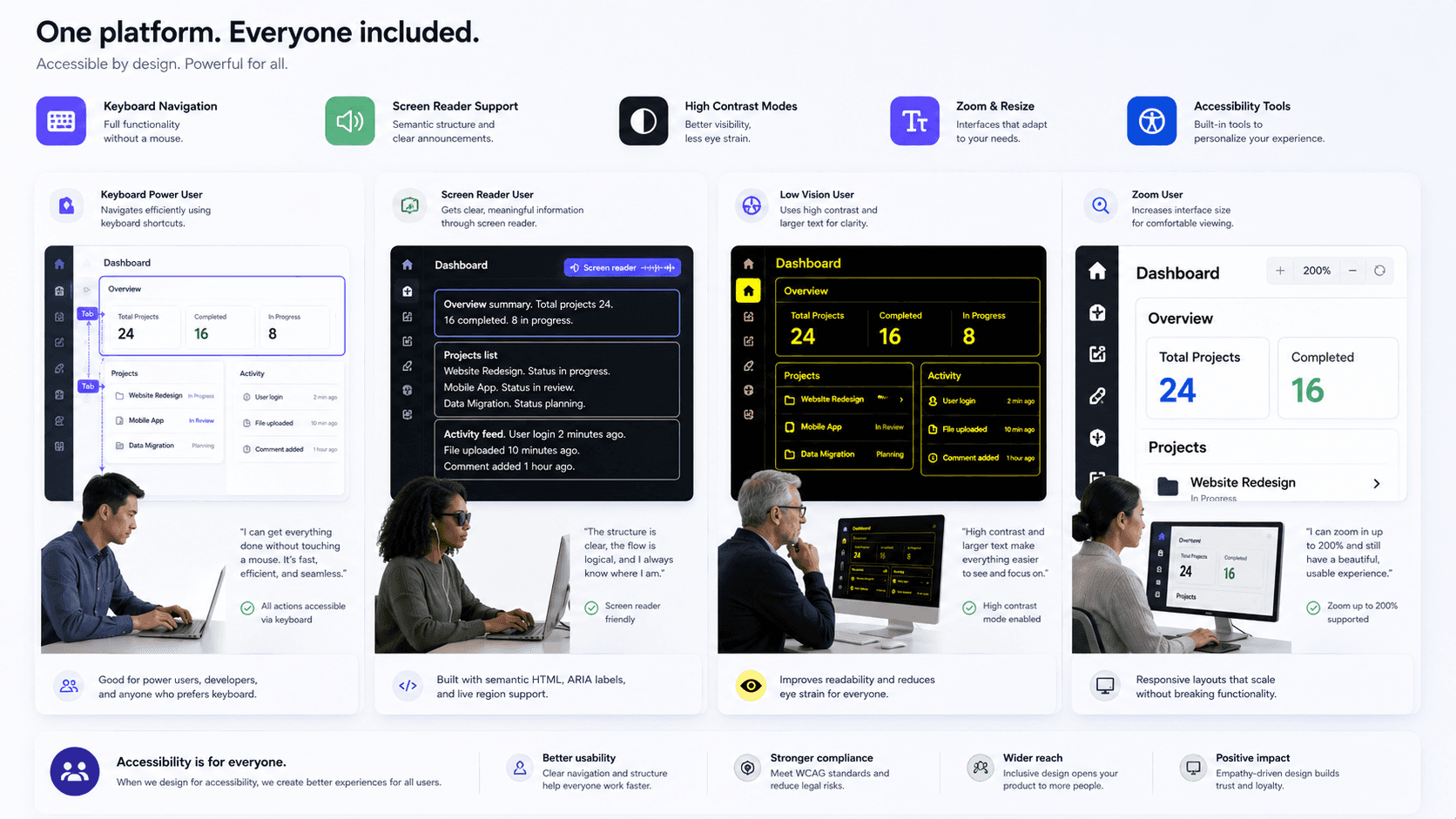
Many organizations still approach accessibility like a checklist.
Questions often sound like:
"Are we WCAG compliant?"
"Did QA approve it?"
"Can we close the ticket?"
Accessibility deserves more than that.
Because accessibility improvements benefit everyone.
Examples include:
Better contrast
Clearer navigation
Better form validation
Keyboard accessibility
Better content hierarchy
These improvements help:
Power users
Older users
New users
Users under pressure
Accessibility isn't a special feature.
It's a good design.
What to do instead
Make accessibility part of:
Discovery
Design
Development
QA
Not something added at the end.
7. Solving UI Problems That Are Actually System Problems
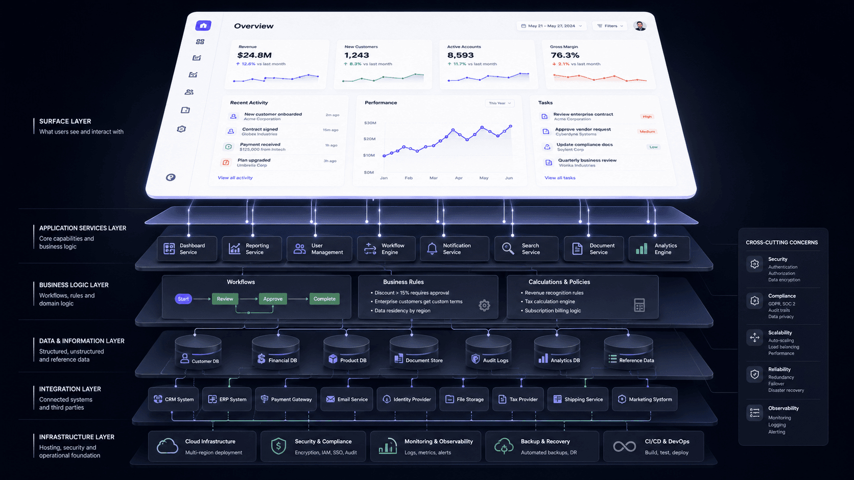
This is probably the most expensive mistake of all.
Teams often identify a UI issue and immediately redesign the interface.
But sometimes the screen isn't the problem.
The underlying system is.
Common examples include:
Poor data architecture
Duplicate records
Permission conflicts
Broken ownership models
Inconsistent business rules
The UI simply exposes those issues.
Redesigning the screen won't solve them.
It's like repainting a house with a damaged foundation.
What to do instead
Ask deeper questions:
How is data structured?
Who owns this information?
What happens over time?
Does the workflow scale?
Are we solving a design problem or a system problem?
The best product designers think beyond screens.
They think about systems.
Final Thoughts
The most expensive enterprise UX mistakes aren't usually visual.
They're strategic.
They emerge when teams:
Skip research
Ignore workflows
Prioritize features over clarity
Design for everyone
Treat accessibility as optional
Build AI without trust
Focus on screens instead of systems
Enterprise UX isn't about making software look better.
It's about helping people complete complex work with less effort, fewer mistakes, and greater confidence.
And when thousands of employees use your product every day, even small UX improvements can create enormous business impact.
Key Takeaway
The biggest enterprise UX mistakes are rarely design mistakes. They're workflow mistakes disguised as interface problems. The teams that recognize this stop designing screens and start designing better systems.
Be the first to know about every new letter.
Stay ahead in the world of web design with expert insights, industry trends, and practical tips.
No spam, unsubscribe anytime.